Blog-Image
  • mrpd123
  • November 21, 2025

  • 0 Comments

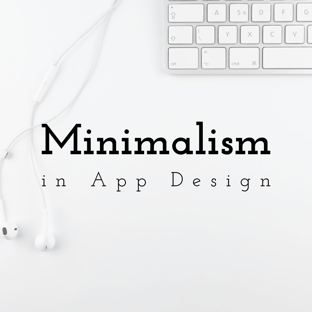
Design Smarter, Not Harder: The Art of Minimalism in Web Design

In the fast-paced digital world, your website has only a few seconds to make a strong impression. Users expect clean, fast, and visually appealing designs. This is why minimalism has become one of the most powerful approaches in modern web design. The concept, often summed up as “less is more,” focuses on clarity, functionality, and user experience. Minimalism is not about removing everything—it’s about removing what doesn’t matter. By simplifying design elements, brands can communicate messages more effectively and create websites that are beautiful, user-friendly, and impactful. This is the essence of The Art of Minimalism: Why Less is More in Web Design. Minimalism in App Design: How Does it Boost User Experience

What Is Minimalism in Web Design?

Minimalism in web design is all about using fewer elements to create a cleaner and more intentional layout. It focuses on: Clean typography   Ample white space   Limited color palettes   Simple navigation   Strong visual hierarchy   The goal is to guide users effortlessly through the website without distractions. Think of minimalism as removing visual noise. This helps users focus on the most important actions—reading, buying, signing up, or exploring.

Why Less Is More: The Power Behind Minimal Minimalist Design

Minimalism works for a simple reason: clarity increases usability. When users land on a clutter-free website, they instantly feel relaxed and engaged. They don’t have to search for information or feel overwhelmed. Everything appears organized, intentional, and easy to navigate. Here’s why minimalism is so effective:
  1. Faster Loading Speed
Fewer visual elements mean lighter pages, which leads to faster loading times. Studies show that slow websites lose visitors within seconds. Minimalism ensures speed and smooth performance.
  1. Stronger Focus on Content
By removing unnecessary distractions, users can focus on your message, product, or story. This increases engagement and conversions.
  1. Better Mobile Experience
Minimalist layouts adapt beautifully to mobile screens. With fewer elements, the layout becomes more responsive and easier to navigate.
  1. Cleaner User Experience
A clean design improves readability and makes users feel more comfortable. Clear pathways guide them toward the right actions.
  1. High Aesthetic Appeal
Minimal design is modern, elegant, and timeless. This makes your website look professional and trustworthy.

Key Elements of Minimalist Web Design

To understand The Art of Minimalism: Why Less is More in Web Design, you need to explore the essential elements that make minimalism effective.
  1. White Space (Negative Space)
White space is the empty area around elements on a page. It creates breathing room and improves focus. Example: Apple’s website uses large areas of white space to highlight products and create a premium feel.
  1. Simple Color Palettes
Minimalist websites usually use 1–3 colors to maintain consistency and calmness. Example: Dropbox uses soothing blues and whites to keep the design simple yet engaging.
  1. Clean Typography
Fonts should be readable, sharp, and aligned with brand identity. Example: Google’s homepage uses simple typography to keep the focus on the search bar.
  1. Visual Hierarchy
Minimalism helps create clear priorities—headings, call-to-action (CTA) buttons, and important sections stand out.
  1. Flat or Simple Graphics
Icons and illustrations should be simple, not overly detailed. They must support functionality, not distract from it.

Real-World Examples of Minimalism Done Right

Minimalism is used by many global brands. Here are some standout examples:
  1. Google
Google’s homepage is the ultimate minimalist design—just a logo, a search bar, and two buttons. No clutter, no distractions. Users know exactly what to do.
  1. Apple
Apple focuses on large images, clean layouts, and minimal text. This highlights the product without overwhelming the user.
  1. Airbnb
Airbnb uses white space, simple navigation, and soft colors to make searching for stays intuitive and pleasant.
  1. Medium
The blogging platform uses clean fonts and generous spacing, making reading comfortable and distraction-free. These examples show how “less” adds clarity and sophistication.

How to Use Minimalism Smarter in Your Web Design

Minimalism is simple—but not easy. Here’s how you can apply the concept effectively:
  1. Prioritize Functionality
Ask yourself: What does the user really need here?   What can I remove without affecting purpose?   Every element must have a reason.
  1. Use White Space Intentionally
White space is a design tool, not empty space. It helps content breathe and creates visual balance.
  1. Keep Navigation Simple
Visitors should understand your website in seconds. Use: Clear menus   Simple icons   Easy-to-find CTAs  
  1. Reduce Text and Be Direct
Minimalism thrives on clarity. Use short, meaningful statements instead of long paragraphs.
  1. Stick to a Limited Color Scheme
Choose colors that reflect your brand’s personality. Minimal palettes help keep the design polished.
  1. Use High-Quality Images
One strong image often replaces multiple design elements. Make sure your visuals are sharp, relevant, and clean.
  1. Maintain Consistency
Use consistent spacing, colors, fonts, and button styles across your website to create harmony.

Benefits of Minimalism for Businesses

Minimalist web design doesn’t just look good—it helps businesses grow smarter.
  1. Higher Conversions
Clear CTAs direct users to take action without distractions, increasing sales and leads.
  1. Improved SEO Rankings
Faster loading speeds and better user experiences boost search engine performance.
  1. Stronger Branding
Minimalism creates a premium, modern identity that customers remember.
  1. Lower Bounce Rates
Clean layouts hold user attention longer and encourage deeper browsing.

Conclusion

Minimalism in web design is more than a style—it’s a strategic approach that focuses on clarity, function, and user experience. By removing unnecessary elements and highlighting what matters most, you create a website that is beautiful, easy to use, and highly effective. This is the true essence of The Art of Minimalism: Why Less is More in Web Design. If you design smarter—not harder—you’ll build digital experiences that capture attention, guide users effortlessly, and leave a lasting impression.

Leave A Comment